Training
Review all of the sections of this tutorial in order. Video tutorials provide an introduction to the following training section where screen captures and more detailed step-by-step instruction is listed.
Follow the instructions of enumerated TRAINING STEPS titled for each of those tutorials.
Your first page should be saved with the training "content owner" section option selected. This will occur when you get to "Create a New Page with Columns (Training Step #2)"
After you have completed the training, select the link at the bottom of this page to complete the CMS training survey.
Page Creation and Component Tutorials
Page Design Considerations
You are asked to comply with the web development guidelines provided by the University Communications and Marketing office. Please review the following documents related to page design and branding:
Things to Know
1. Font faces and colors are preset and should not be modified.
2. The "accordion component" should span the width of the page.
3. Content in the "accordion component" can act as a page within a page, reducing overall page count leading to easier site management.
4. The "card component" should include a photo or graphic.
5. Subsequent content pages will automatically have a link to the department home page placed in the masthead below the title of the page ("breadcrumb").
6. All saved web pages are subject to review by University Communications and Marketing staff. You may be requested to make modification to the content and layout in an effort to maintain compliance with web development guidelines
7. Contact ucm@uwrf.edu with questions about graphics, photos and guidelines.
Tutorial Video: How to log in
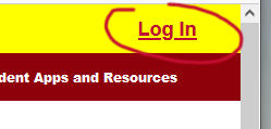
How to Log In (Training Step #1)
- Visit the editing section of the server.
- Log in
Updating a large number of pages frequently?
You can install the UWRF Edit bookmarklet to easily switch a public page to the editing site. To install it, drag the UWRF Edit link into your Bookmarks toolbar. In Firefox you may also right-click the links and select Bookmark this Link. Once the bookmarklet is installed, just click it while on a UWRF page and it will switch the page over to the edit version.
Tutorial Video: Edit a page and adding an image
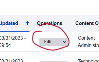
Edit an Existing Page
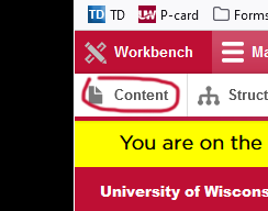
1. Choose manage and content button.
2. Scroll to page or filter by page name and content owner to find page.
3. Choose edit.
4. Choose the item you wish to edit and select the pencil icon.
5. Save the change.
6. Save the page.
Tutorial Video: Create a new page
Correction:
The URL of this page will be http://students.uwrf.edu/training/cms-training
Domain / content owner section /page name
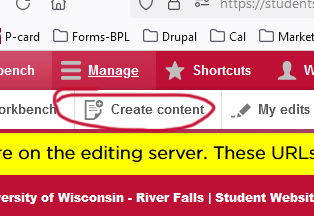
Create a New Page with Columns (Training Step #2)
Note: Authors will be assigned a permission group(s) that correlates to the office or department they work in (e.g. dining, residence life, honors). The permission group correlates with the "content owner" section the pages are stored in AND the "content owner" section name appears in the URL of the page. (e.g. http://students.uwrf.edu/dining/meal-plan)
1.Choose create content.
2. Choose the page type. Use a "Department Page" for the home page of a "content owner" section . Use a content page for other pages within the "content owner" section. Note: If you don't have an option to create the department page, one has already been created in the "content owner" section.
3. Title the page (title will appear in the header).
4. Create a description.
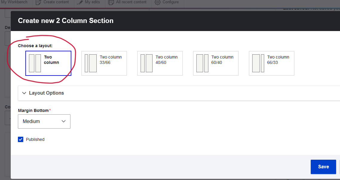
5. Add a column section under page content (choose how many columns to set the configuration of the page.).
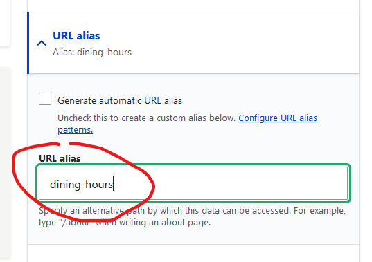
6. URL alias: Check the box to adopt the title of the page as the URL.
There will be no trailing extension like .htm or .cfm. A page name will be generated automatically. To change the URL that automatically populates, please contact DoTS.
The URL of this page will adopt the content owner value and the name of the page https://students.uwrf.edu/dining/catering
Domain / section /page name
7. Add a component to the column. (See components below)
8. Add the content to the component; text is the most used. Refrain from adding images to a text block. Place images in a separate column section using the image component.
9. Save the component.
10. Choose a content owner value that is most applicable (this correlates with the column section in which the page resides)
11. Select "save as published."
12. Save the page.
Add a section within a column (Training Step #3)
Text or other components are nested in the columns sections of the page.
1. Choose desired layout.
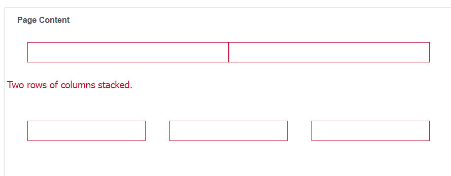
2. Column rows can be stacked vertically.
3. Use arrow keys to move column elements and push Enter to “save."
4. For margin bottom select "tiny" or "small"
Note: Sometimes content in the far right column will appear under the far left column. Disregard this positioning, it will display properly to visitors.
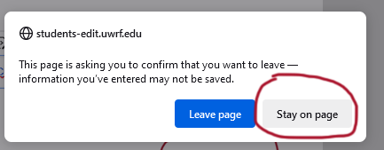
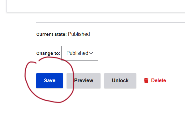
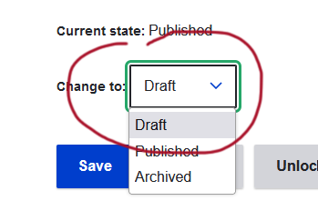
"Save early, save often" and Unpublished Content
Not only is it good practice to save your changes often, it's also important to know what is being saved when save it selected.
IMPORTANT: Saving content within the element is not the same as saving the page; these are two separate steps.
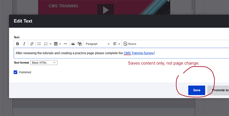
If you attempt to leave the page before saving the page, you will receive a prompt. Stay on the page or the change will be disregarded.
Scroll to the bottom of the page and select "save"
If you want to preserve the change to the element, but do not want the change to be visible to page visitors, select draft, then save.
Tutorial Video: Creating Links
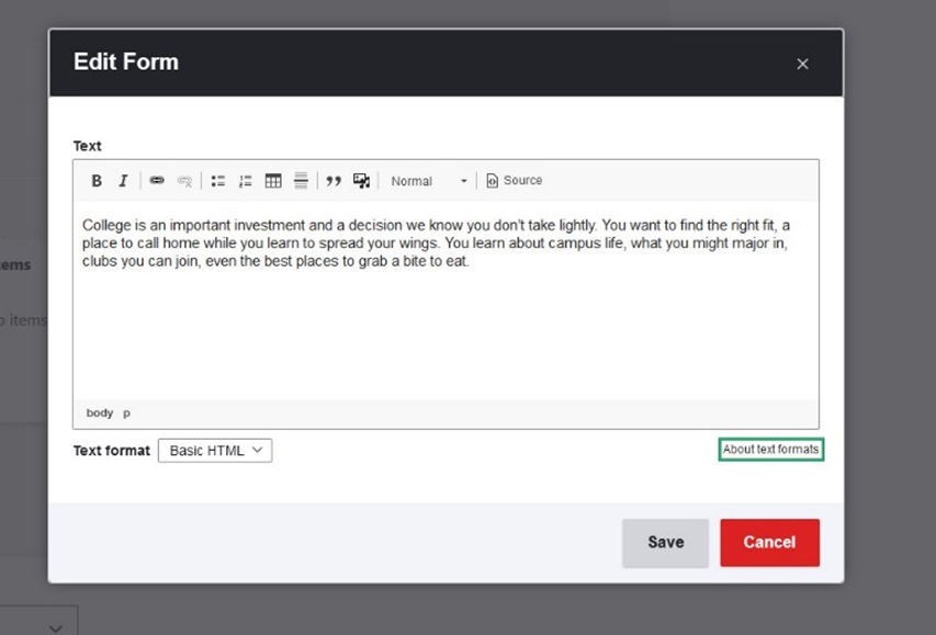
Add a Text Component and Create a Link (Training Step #4)
1. Select "choose a component."
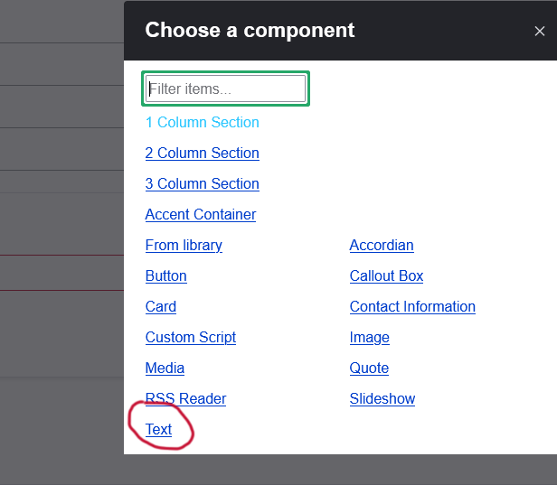
2. Select "Text."
3.Type or copy and paste text.
Adding a link
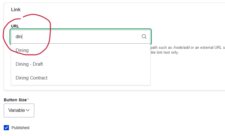
1. Select the text you want to be clicked
2. Click the link icon in the menu
3 To link to an existing page within Drupal, type the name of the page and select it accordingly from the revealed options. For an off-site link, paste the URL into the field, including the https:// portion.
4. Important: Select the green check box. (The URL will appear as a "node" associated with page)
5. Save changes to the component.
Images: Images should not be included in the text component unless the text block is inside another component like a call out box or an accordion. Use the image component and place images adjacent to text component.
Tip: sometimes a bug in the software results in the inability to access the save button after large portions of text have been pasted in.
- Try selecting "CTRL+ the minus key" to zoom out your screen reveal the save button. Select the "CTRL+ the plus key" to restore the font size.
or - Try adding only one paragraph. Save the remaining content. Open the text box again and move it up by clicking and moving the top of the frame to reveal the save button. Add the remainder of the content and save.
Image Component (Training Step #5)
Images components can appear next to other components. (Images that appear inside accordions and other components are generated within the component and are NOT a separate component. )
1. Select the image component.
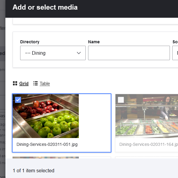
2. Choose "add media."
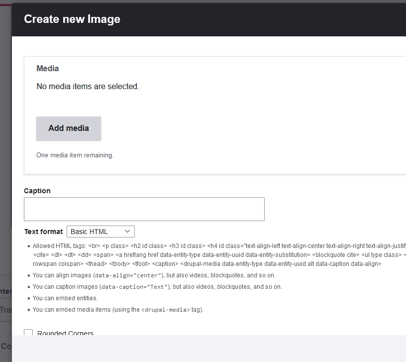
3. You have two options:
- Upload a new image, add alternative text, assign it to the correct directory (content owner section), save then select it from that content section or
- Retrieve an existing image, search by file name under the appropriate directory (content owner section).
Accordion Component
An accordion allows the paragraph content to be revealed when a visitor clicks on the plus sign or the title.
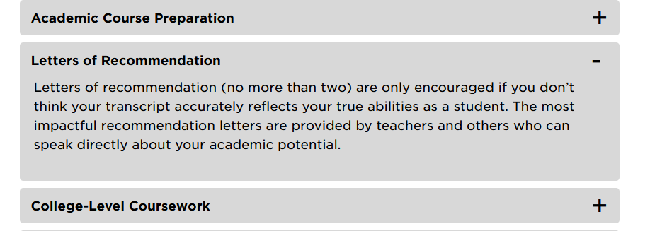
1. Choose the title of the accordion.
2. At the bottom of the component are buttons labeled "add paragraph," "button," "image" and "text." Button, image and text will be your most used components. Click the corresponding button to add your desired component to the accordion. You can add more than one component within an accordion.
Call Out Box Component (Training Step #6)
Call out boxes highlight content with reversed text.
- Choose the call out box component.
- Add the text.
- Save.
Tutorial Video: Layouts, Cards, and Call Out Boxes
Button Component
- Add the label of the button and URL.
- Spelling the first few letters of the page you want to link to will reveal the page if it exists in Drupal or paste in a full URL.
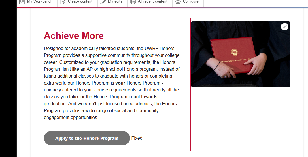
Card Component (Training Step #7)
Cards work best with two or more columns in a row. The decision to use a card should be driven by the need to use an image to highlight the content and to drive a "call to action." Use a call out box if you want highlight text but are not including an image. A call to action button can be included in a card.
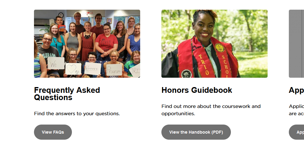
- Add the card component to the section
- Include an image. Upload a new image or find an image hosted in Drupal (see upload and replace an image section).
- Add a title.
- Add Card text. You may add HTML tags to insert line and paragraph breaks. View the key that is listed below the fields.
- Add a button (see button tutorial)
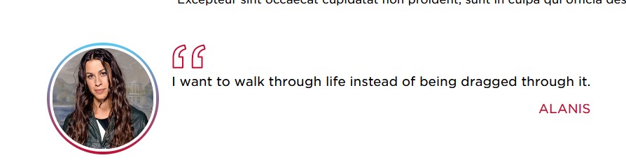
Quote Component (Training Step #8)
- Add a new image.
- Add the quote.
- Include citation.
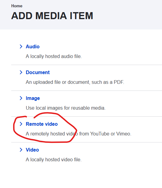
Posting Media: Images and Remote Video (Training Step #9)
- To post media independently of a component, in edit mode, choose "media."
- Choose "add media."
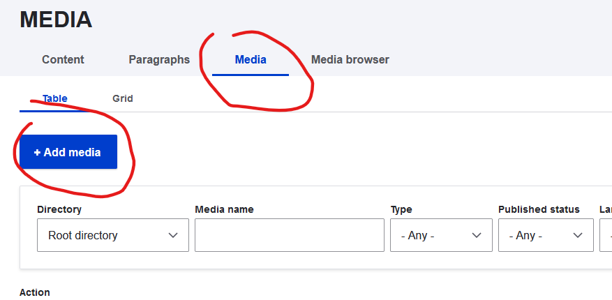
For images
- Choose "Image."
- Choose "add media."
- Select the directory to which the image will be posted.
- Upload an image from your source. (Ensure the image is narrower than 1100px wide and less than 1.5 megabytes.)
- Save.
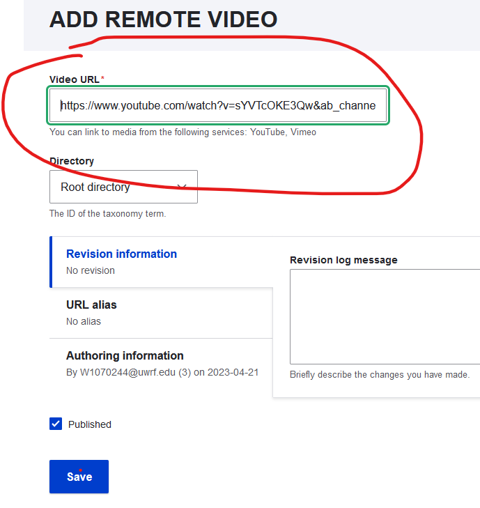
For Remote Videos
- Find and copy the URL to the video (A YouTube video for example).
- Choose "add media." Then choose "add remote video."
3. Paste the URL in the video field.
4. Select the directory to associate the link.
5. Save.
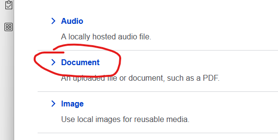
Uploading a PDF into Drupal
Choose add media and then select "Document"
Select browse to find the source of the document. Select the directory the file will reside in.
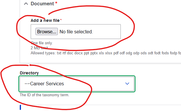
Review the name of the file and directory name, then select save.
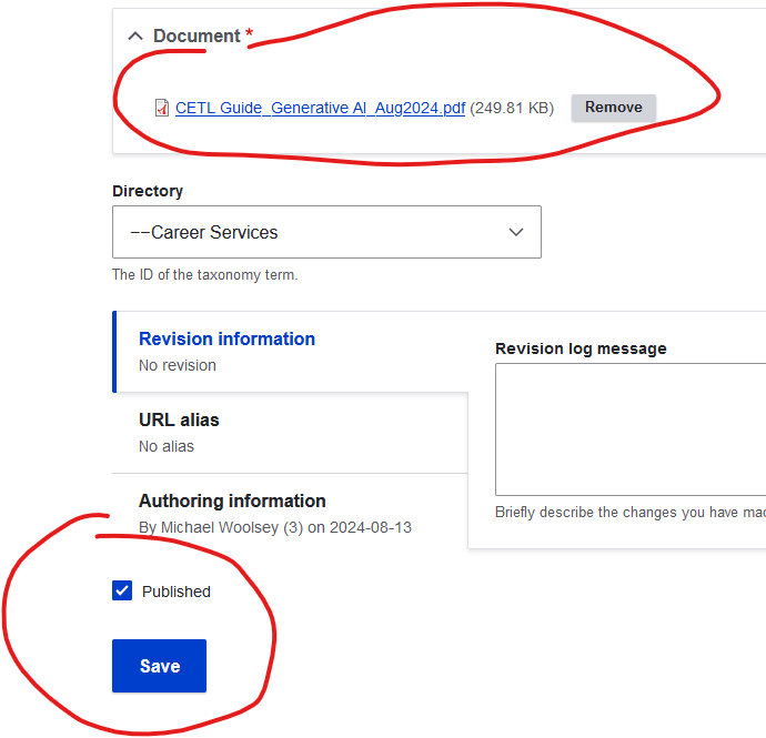
Link to the document in the same way as creating a link to a content web page. Highlight the text to be linked and type the name of the PDF to reveal the location.
Tutorial Video: Reverting to old page version and editing
Resizing Images
Many times the original photo is too large and it's necessary to resize an image before posting it to a page. Following are steps using MS Paint (Windows users).
1. Open Microsoft Paint
- Click the Start Menu (Windows icon).
- Type “Paint” in the search bar.
- Click on Microsoft Paint to open it.
2. Open Your Photo
- In Paint, click File (top-left corner).
- Select Open.
- Browse your computer and choose the photo you want to resize.
- Click Open.
3. Access the Resize Tool
- In the top toolbar, click the Resize button (it may say “Resize and Skew”).
- A pop-up window will appear.
4. Choose How to Resize
You have two options:
By Percentage
- Select Percentage.
- Adjust Horizontal and Vertical values (e.g., 50 reduces size by half).
By Pixels
- Select Pixels.
- Enter a new width or height.
- Make sure “Maintain aspect ratio” is checked to avoid distortion.
5. Apply the Resize
- Click OK.
- Your image will now appear resized in the Paint window.
6. Save Your Resized Photo
- Click File again.
- Choose Save As.
- Pick a format (e.g., PNG, JPEG).
- Enter a new file name (recommended to keep the original unchanged).
- Click Save.
Web Accessibility Review
All UWRF web pages must be compliant with US federal government standards. Please spend the next 10 to 15 minutes reviewing our accessibility guidelines under the Web/Digital Accessibility section of the Accessibility Resources webpage.
After reviewing the tutorials and creating a practice page please complete the CMS Training Survey.